")


")


")


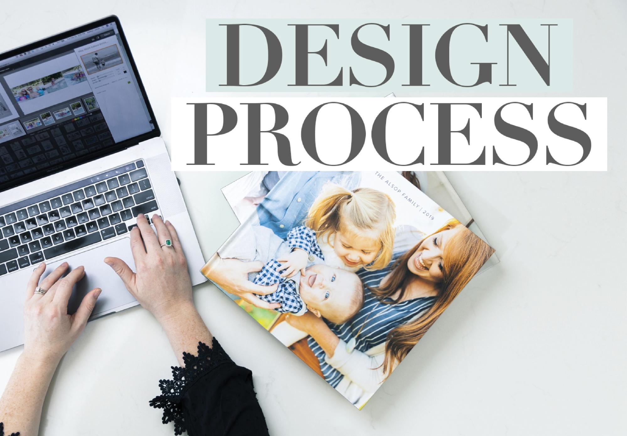
This is such a fun post for me to share because it’s what I consider my “hobby”! Sure, it’s still photo-related so maybe it’s not a true hobby for me since my career is consumed in the photography world… but it is most definitely what I love to do for fun!
This brand new Youtube episode is dedicated to talking through HOW I actually make design decisions when it comes to my family album spreads!! How do I select which images go where? How do I find patterns and what system do I use to piece this massive project together?!
Well, before I dive in, let me first give you some stats and info on my Family Yearbook process:
- Time it takes to complete: 10-12 hours of work during our “Netflix” time on the couch in the evenings!
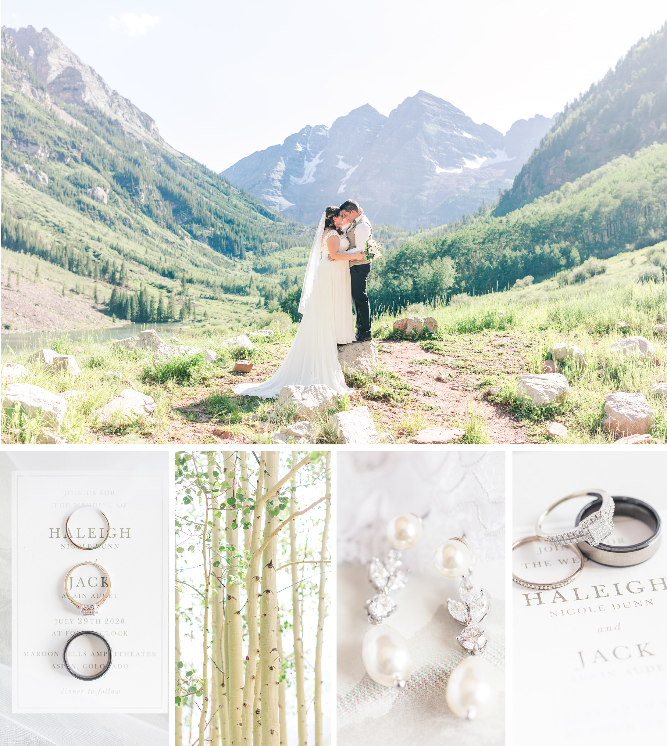
- How big is it?! Well, the last two years I have overdone it. I actually have created over 400 pages and two volumes. NORMAL people wouldn’t do this. They would probably have a 100-150 page book. I’m excessive and I know it!
- What size is your book? It’s a 12×12 photo book!
- Where do you get it printed? BLURB! With Standard Pages!
- What album are you using to design your spreads? Smartalbums and I LOVE this program!!!
- Do you do one album per year or per kid? Just one album! It’s too overwhelming to try and divide up images per kid. I can’t imagine how I would make that work!
In this Youtube Episode, I’m going to be taking you through the thought process behind piecing together my Family Yearbook Spreads. There are so many aspects of this process that are just second nature to be but I actually really enjoyed breaking it down and thinking through WHY I made certain decisions and what visual patterns I was paying attention to!
Overall, here are some design tips that I shared in the video! ….
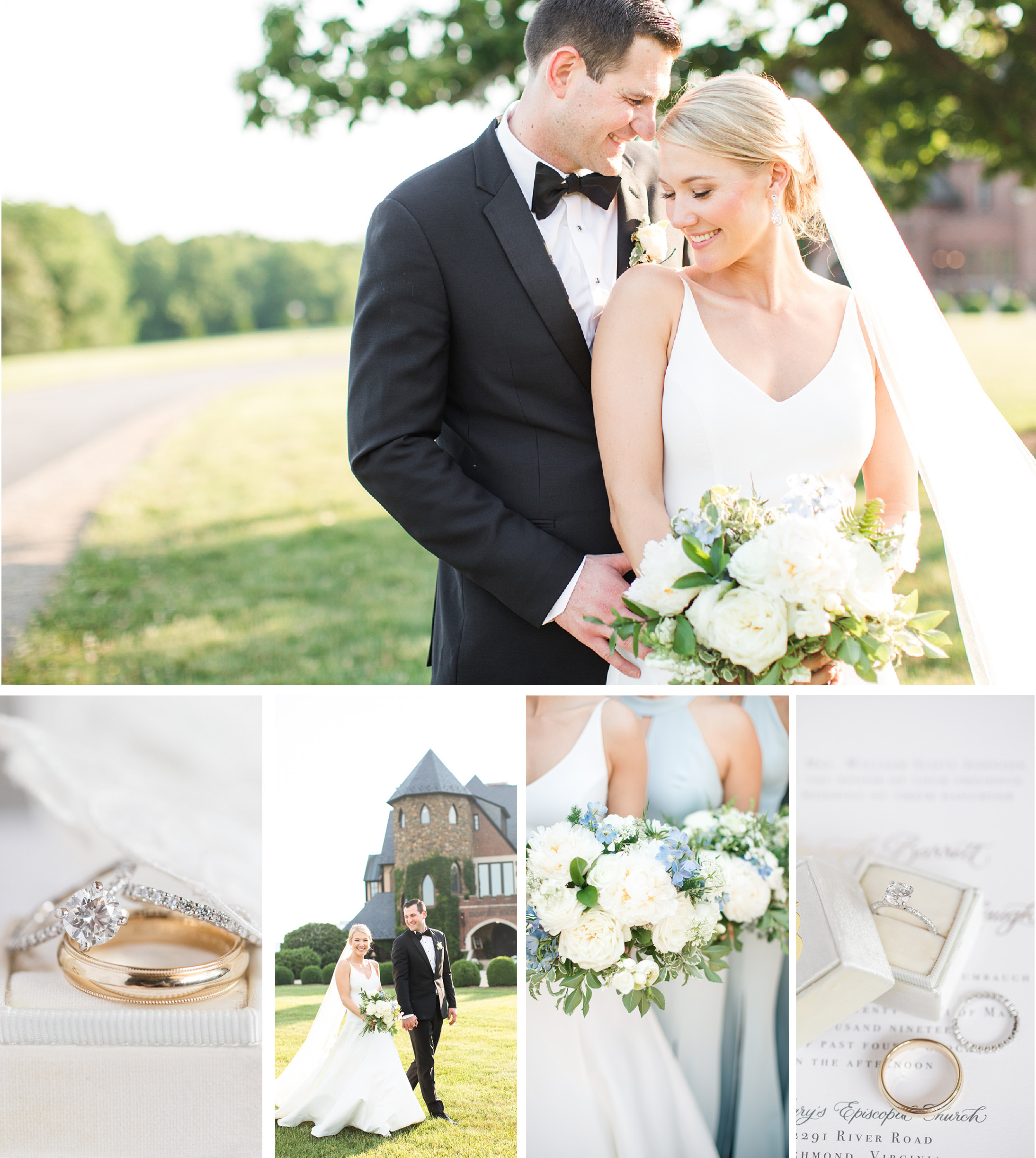
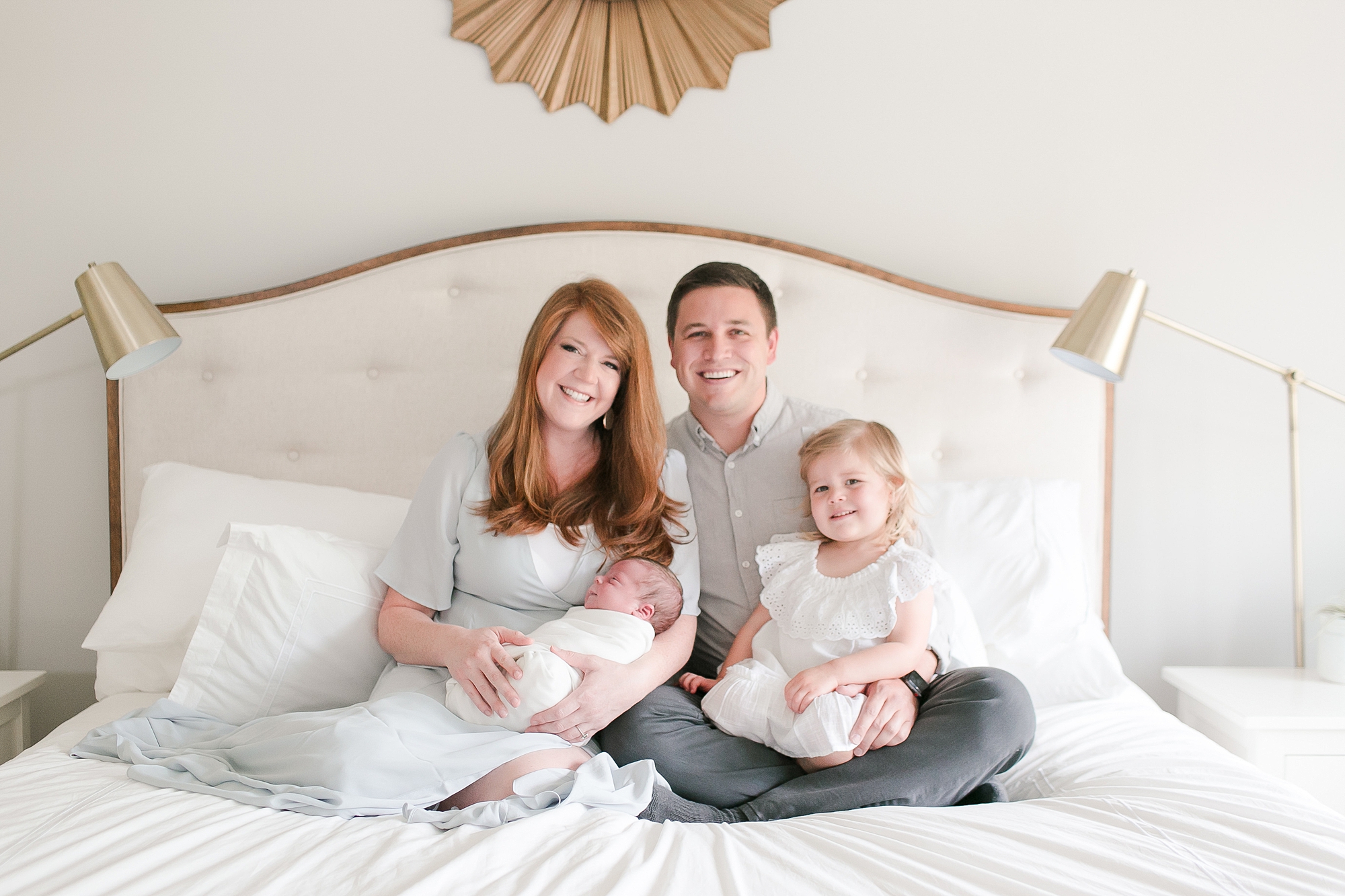
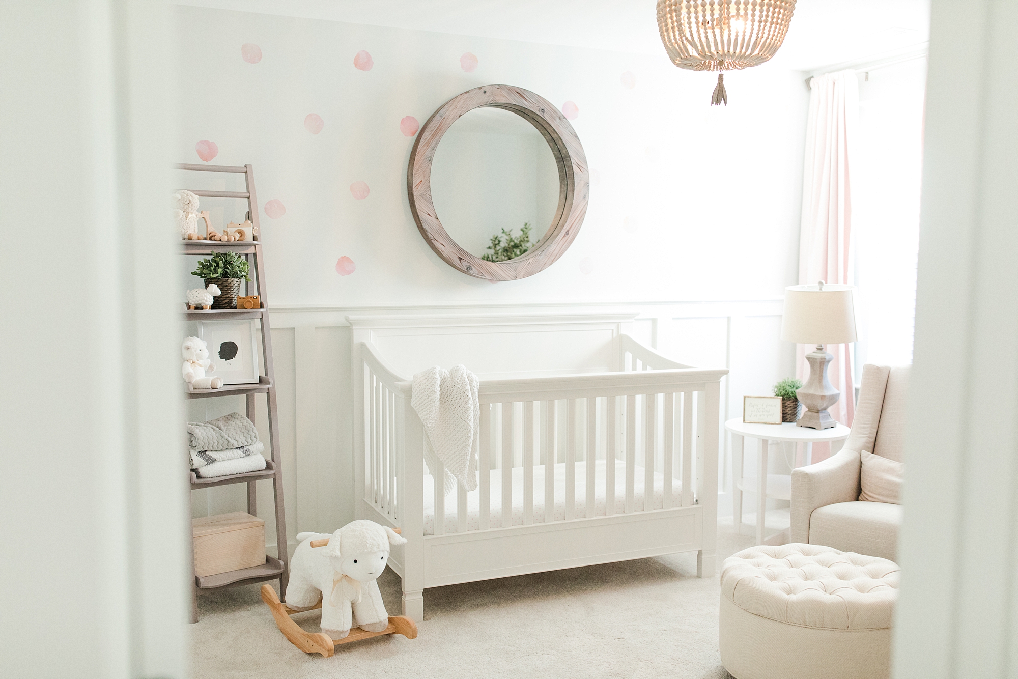
When designing album spreads, I’m looking for:
- Variety of pulled back and tightly cropped shots
- Simple groupings (not too many images on one spread)
- Images that can fit over the spine and not get lost in the crease!
- Images that share similar color patterns
- Out of a group of related images, I look for a dominant photo or a dominant pattern (ex: One bold image to be big and the focal point or a dominant pattern like using all verticals)
There are so many other tips shared in this episode! If you find it hard to comprehend what I just listed out, be sure to watch this video to see real examples of them in action!!! Enjoy!
.
Thanks for reading!
— Katelyn


MORE RECENT POSTS
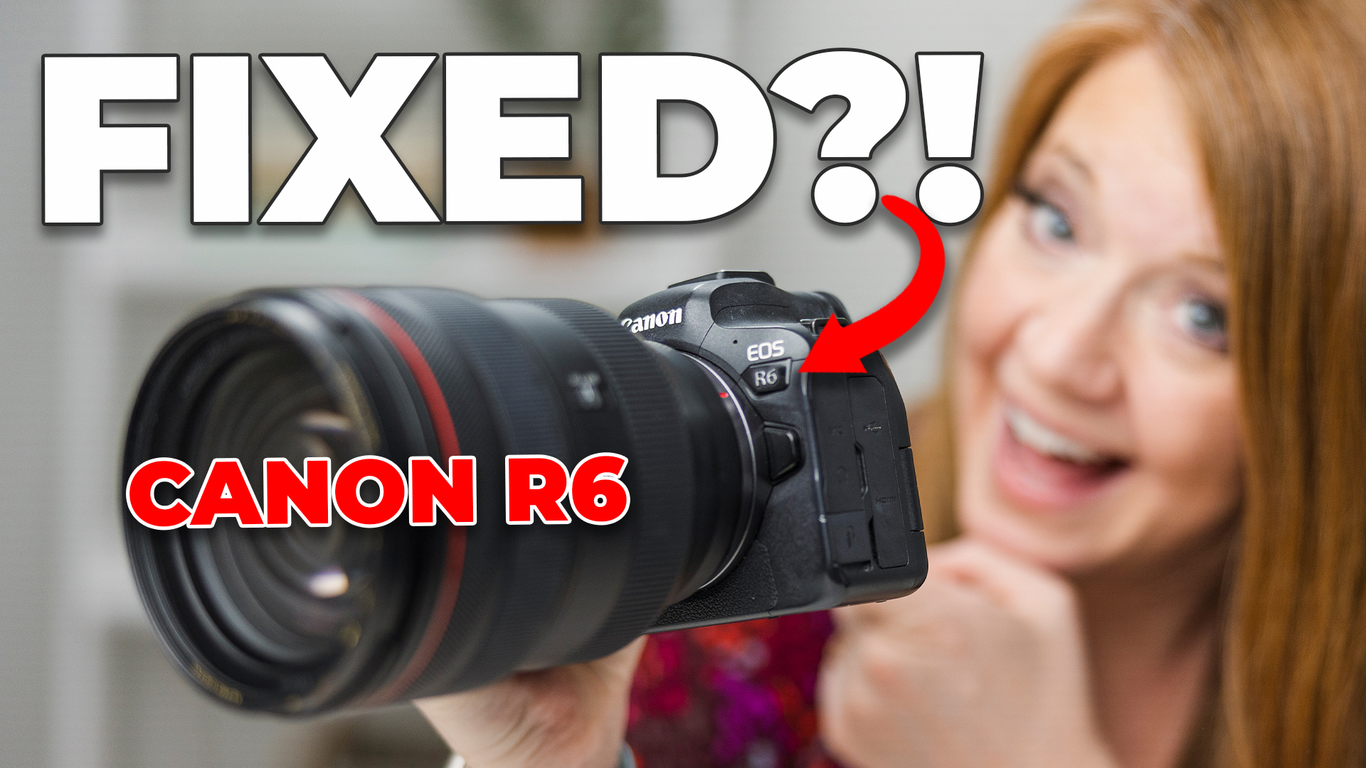
A year ago, we promised to find a solution for those who were complaining about their R6 raw files looking dull and lifeless in Lightroom. However, due to various circumstances, we couldn’t deliver on that promise until now.
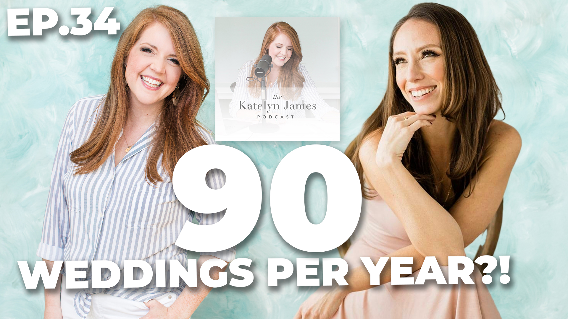
Kelly is an incredible wedding photographer who has been shooting 90 weddings a year. I know, it sounds unbelievable, but it’s true! Kelly’s success and the volume of work she handles is truly impressive.
Your sessions should be working FOR you not against you!
Top Personal Posts


Have a little time to read?


"Best money I have EVER spent on education! ... and I've spent a lot!”

"I love all the lessons I'm learning from KJ All Access! Thanks Katelyn!”

"I find very few educational resources worth it ... this one is!”


"Being able to see behind-the-scenes of Katelyn interacting with her clients has been SO impactful!”

"SO worth it! It's amazing the amount of knowledge you get out of them!”

"I learned just as much in one All Access as I did in a whole course! SO GOOD!"

The KJ blog
must-reads


YOUTUBE

")


")
